Design and develop a digital product — a mini-program (Part 1/2)We developed our first ever mini-program after four-month work🤗(not yet finished, but nearly there). The product aims to provide users —…Mar 28, 2022Mar 28, 2022
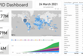
Published inGeek CultureCreating Your First Customized COVID Dashboard in Power BI — A Step-by-Step GuideWith live data from GitHubMar 26, 2021Mar 26, 2021
Published inTDS ArchivePlot choropleth maps with shapefiles using GeopandasChoropleth maps are useful and powerful visualisations which present data by areas or regions that colored or patterned according to the…Mar 18, 2021Mar 18, 2021
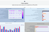
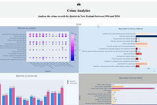
Published inTDS ArchiveCreating an interactive dashboard with Dash Plotly using crime dataMy previous article briefly introduced how to develop a simple dashboard with Dash. As a big fan of visualisation, a dashboard like that…Mar 9, 2021Mar 9, 2021
Published inTDS ArchiveCreate a simple dashboard with Plotly & DashSince last time I played with Serie A data and created some charts with Plotly, I thought I should take one step further and try to create…Mar 1, 20213Mar 1, 20213
Published inTDS ArchiveVisualise Serie A (Football League) data with Pandas and PlotlyLast time I played with the Serie A data trying to understand a little bit more about Milan Derby. Then I was thinking to do more…Feb 21, 2021Feb 21, 2021
Published inTDS ArchiveAnalyse Milan Derby data from 1993 with Pandas and PlotlyThe next Milan derby will kick off next week, to provide a bit more information and visualisation to my football fan husband as well as…Feb 17, 2021Feb 17, 2021